By Catherine Wieczorek, Visual Communications Designer, Ci3 Design Thinking Lab
How do you create a youth-facing brand for adolescent sexual and reproductive health (ASRH) education and awareness? This summer, during four workshops Ci3’s Design Thinking Lab did just that. During the spring, we invited 14 young people from several neighborhoods on Chicago’s South Side to our workspace at the University of Chicago campus. During each session, we asked young people to give input on different aspects of the brand such as voice, visual look, and name.

In the first few workshops, we wanted to learn about the “voice” that we might use. To help us understand how the brand would speak to young people, we turned to celebrity culture and famous people to learn who and what feels authentic to young people. We asked them about their ideal “celebrity” health care provider. Their responses ranged from Chance the Rapper to Michelle Obama. Even Cardi B and Jeff Goldblum made the original cut. Through this exercise of elimination, the group consensus eventually showed us that it was crucial for young people to have a provider that was open minded, approachable, and knowledgeable. Understanding these personality traits helped us create activities to test how brand voice should be executed.
Another aspect of voice is the actual language used for messages. Young people have a number of rights when it comes to sexual and reproductive health care. But does health care as a right appeal to young people? We focused on testing language for posters with messages about young people’s rights regarding obtaining health care. One example included a poster that featured language about how young people, 12 and older, can legally and confidentially access sexual health services without an adult. During this activity, which we called Ripped from the Headlines, young people reviewed the poster headlines, crumpling up and tossing headlines that they thought were “doing too much,” improving headlines they thought were okay, and praising headlines that they thought would connect with their peers. These headlines were later incorporated to other activities testing language and ultimately the final copy standards.
Next we focused on what the brand would look like. As we explored the visual part of the brand, we invited the participants to create their own posters. They showed us which colors, typefaces, and pictures they would love to see in their school or on social media. Overwhelmingly, young people stressed that if we wanted teens to look at our posters, we needed photos of teens that best represented themselves and their peers. Additionally, we learned that our visual materials must also have bold headlines, easy-to-read health care copy, and vibrant colors. One participant said, “The biggest part of the brand project was trying to understand what teens would want to see on the posters–so I figure if it was something we relate to, they’ll be more open to using the services.”
With voice and visual considerations clarified, the next final question was coming up with a name. The naming exercise started with the DTL team whose members synthesized hundreds of words, creating a short list of potential names for young people to vote on. The young people settled on five possible names. In the next months, DTL will receive additional feedback using focus groups with local teens and young adults on these names and will continue to develop the brand standards around the core youth-centered visuals.
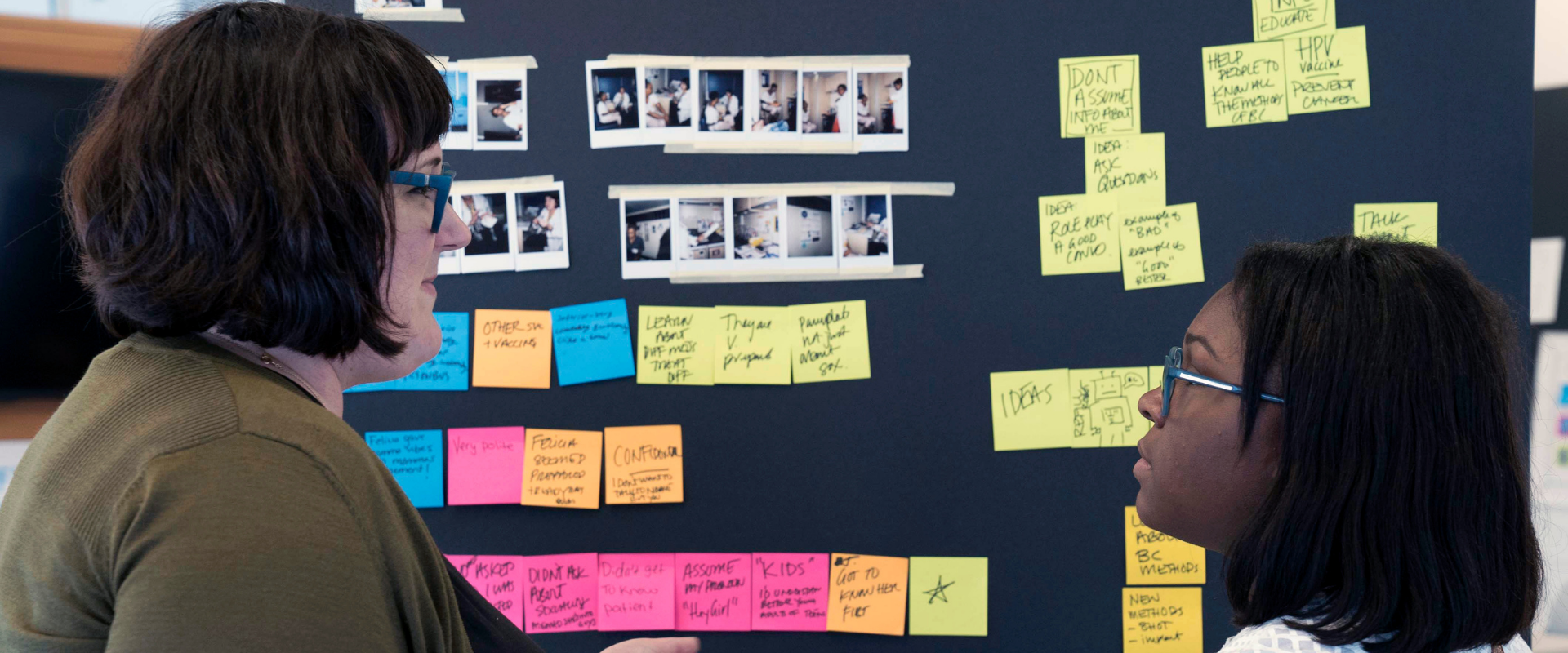
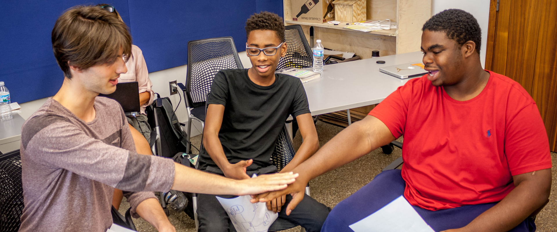
To see the process in action, take a look at the workshop pictures below.


